





Hosted Document Library Pro comes with built-in styling that looks good out of the box, and it gives you design controls so you can match your libraries to your own brand without touching any code.
Where the styling options live
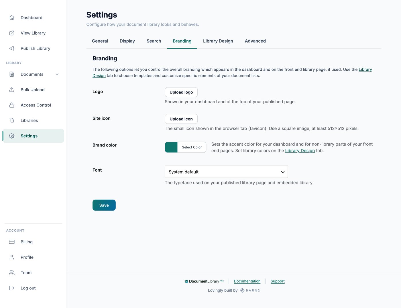
There are two places to set the appearance of your hosted document libraries. The Branding tab covers your logo and overall brand, while the Library Design tab controls how the document lists themselves look.
Styling is set once for your whole account rather than per library. Whether your download and preview links appear as buttons, icons or plain text is set in each library’s own display options rather than on the Library Design tab.
Branding
The Branding tab includes these account-wide controls:
- Logo. Shown in your dashboard and at the top of your published library page.
- Site icon. The small icon in the browser tab. Use a square image, at least 512 by 512 pixels.
- Brand color. Sets the accent color for your dashboard and for the parts of your published pages that sit outside the library itself, such as the password screen, the page menu and the email capture form.
- Font. The typeface used on your published library page and your embedded library. Choose one of the fonts listed, or choose Custom and name any Google Font.
Choosing a template
The Library Design tab includes a set of pre-built templates for both the table and grid layouts. Pick the template that suits you as a starting point, then adjust it to fit your brand. Because appearance is set at the account level, the look you choose applies consistently across all of your libraries.
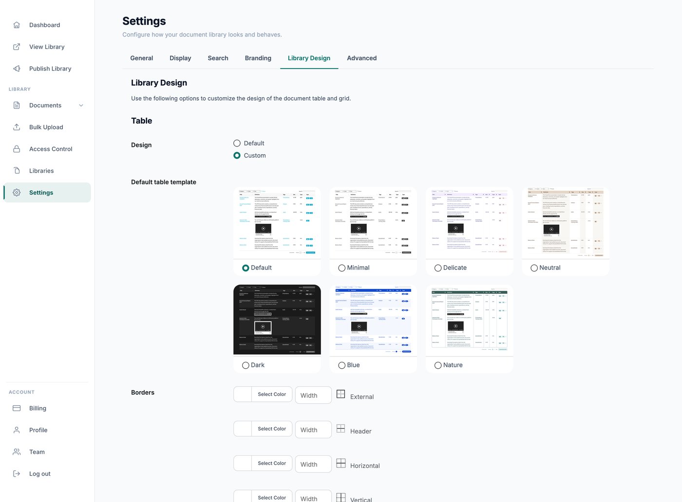
The seven templates available for both table and grid layouts are Default, Minimal, Delicate, Neutral, Dark, Blue and Nature.
Customizing the appearance
From the same Library Design tab you can fine-tune the styling, such as colors and other visual details, to bring your libraries in line with your branding. Changes are previewed as you make them, so you can see the result before you save.
The detailed controls appear once you set Design to Custom for that layout, and each layout has its own Reset to the default button.
Table layout
- Templates and border styles for the outer border, header, horizontal, vertical and bottom borders, each with a color and width
- Background colors for the header, the main rows, alternate rows, buttons, button hover and disabled buttons
- Font color and size for the header, main text, links, buttons and disabled buttons
- Alternate row or alternate column shading, or neither
- Corner style: Square, rounded or fully rounded
- Search box background, text color and border
- Filter dropdown background, text color and border
- Checkbox border color
- Row spacing: Compact, normal or spacious
Grid layout
- Templates
- Background colors for the document image, category badge, card, buttons and button hover
- Font color and size for the main text, links and buttons
- Borders for the card, buttons, search box and filter dropdowns
- Search box and filter dropdown background, text color and border
- Checkbox border color
- Corner style
Folders
- Color of the top level folder icons
- Color of the sub level folder icons
- Your own open and closed folder icons, added as SVG code
Keeping a consistent look
Because the template and design options are applied across your whole account, every library you build shares the same styling automatically. This keeps your collections looking consistent wherever you embed them, whether that is on a WordPress site, Squarespace, Shopify, Wix or your hosted library page.
Need something the settings do not cover?
Our support team can apply custom styling for you. Please get in touch describing what you want, ideally with a link to your library and a screenshot marking the part you mean.
Examples of custom styling we can help with:
- Matching a specific brand font or a color that is not in the settings
- Adjusting column widths, or hiding a column on smaller screens
- Changing the shape or spacing of the search box, filters and buttons
- Hiding a control you do not use, such as the page length dropdown
- Tightening or loosening the space between rows