Most people show each piece of information about a document as its own column in the table. Some, though, prefer the description or summary to sit full-width underneath the rest of the document’s details rather than squeezed into a narrow column. Hosted Document Library Pro can produce this effect using its responsive column controls, no code required.
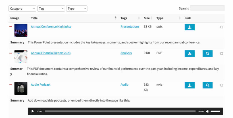
The result is a table where the main details appear in a row as usual, and the description or summary spans the full width on its own line below:
How it works
The table layout has a responsive feature that can move a column out of the main row and into an expandable area below it, known as a child row. By telling your library to always show that child row, and setting one column so it never appears as a normal column, that column drops down into the full-width area on every device instead of taking up space in the row.
Setting it up
In your library’s design settings, work with the column and responsive options:
- Open the columns settings for the library and find the responsive display option. Set it so the child row is always visible, rather than only opening when someone clicks to expand a row.
- For the column you want full-width (for example the description or summary), set its responsive breakpoint so it never shows as its own column. With the child row always visible, that column then appears full-width below the main row.
- Leave the breakpoints for all the other columns at their normal setting so they continue to display in the row as usual.
Save your changes and preview the library. The description or summary will now span the full width beneath each document’s other details.