Document Library Pro gives you several ways to control how your table behaves on different screen sizes, such as phones and tablets. You set these options in the advanced column settings in the Library Builder when you add or edit a table.
Wrap
The wrap option tells the table whether to flow long content onto more than one line or to keep each row to a single line and hide the rest. The default lets longer content wrap onto extra lines as needed. Turning wrap off keeps every row exactly one line high.
Priorities
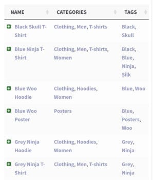
The priority option matters on smaller screens, and when you have so many columns that the table cannot fit everything in. When the screen gets too narrow, the table collapses certain columns so they are no longer visible and shows a “+” icon at the left of each row. Clicking that icon expands the row to reveal its full contents.
Priority decides the order in which columns are collapsed on smaller screens. The lower the number, the higher the priority, so a column with priority 1 is collapsed last. For example, with a title, author and categories column you could make title the most important, categories second and author least important.
Responsive visibility
Responsive visibility gives you finer control over which columns appear on each device. By default the table shows or hides columns on smaller screens based on the priorities above, but you can instead choose exactly which devices each column shows on. The usual choices are desktop, tablet, mobile, all, none or default:
- A specific device (such as tablet) shows the column on that device only.
- All keeps the column visible at every screen size.
- None hides the column from the table itself, although it still appears in the expanded row when a visitor clicks the “+” icon.
- Default lets the plugin decide, using the priorities if you have set them.
Bear in mind that the table can only show columns that physically fit each screen size. If you set more columns to visible than will fit, some are still hidden so the table never looks broken.
Responsive control
When the table cannot fit everything in the space available, a “+” icon appears to the left of each row so visitors can expand it. The responsive control option sets whether that icon sits inside the first column, which is the default, or in its own separate column.
By default you cannot hide the first column of the table because it contains the “+” icon. If you need to hide the first column, set the responsive control to put the icon in its own column instead, and then you can hide the first column successfully.
Responsive display
The responsive display option sets how the extra columns appear when a visitor expands a row on a small screen:
- Child row is the default. The extra data appears in a hidden child row.
- Child row visible shows that child row expanded automatically when the table first loads.
- Modal shows the extra data in a popup window when the “+” icon is clicked.