


Hosted Document Library Pro includes several elements you can show above or below the table to help visitors search, sort and page through your documents. You switch these on or off in the Library Builder, and you can fine-tune where some of them appear on the settings and design page for your library.
The available elements are:
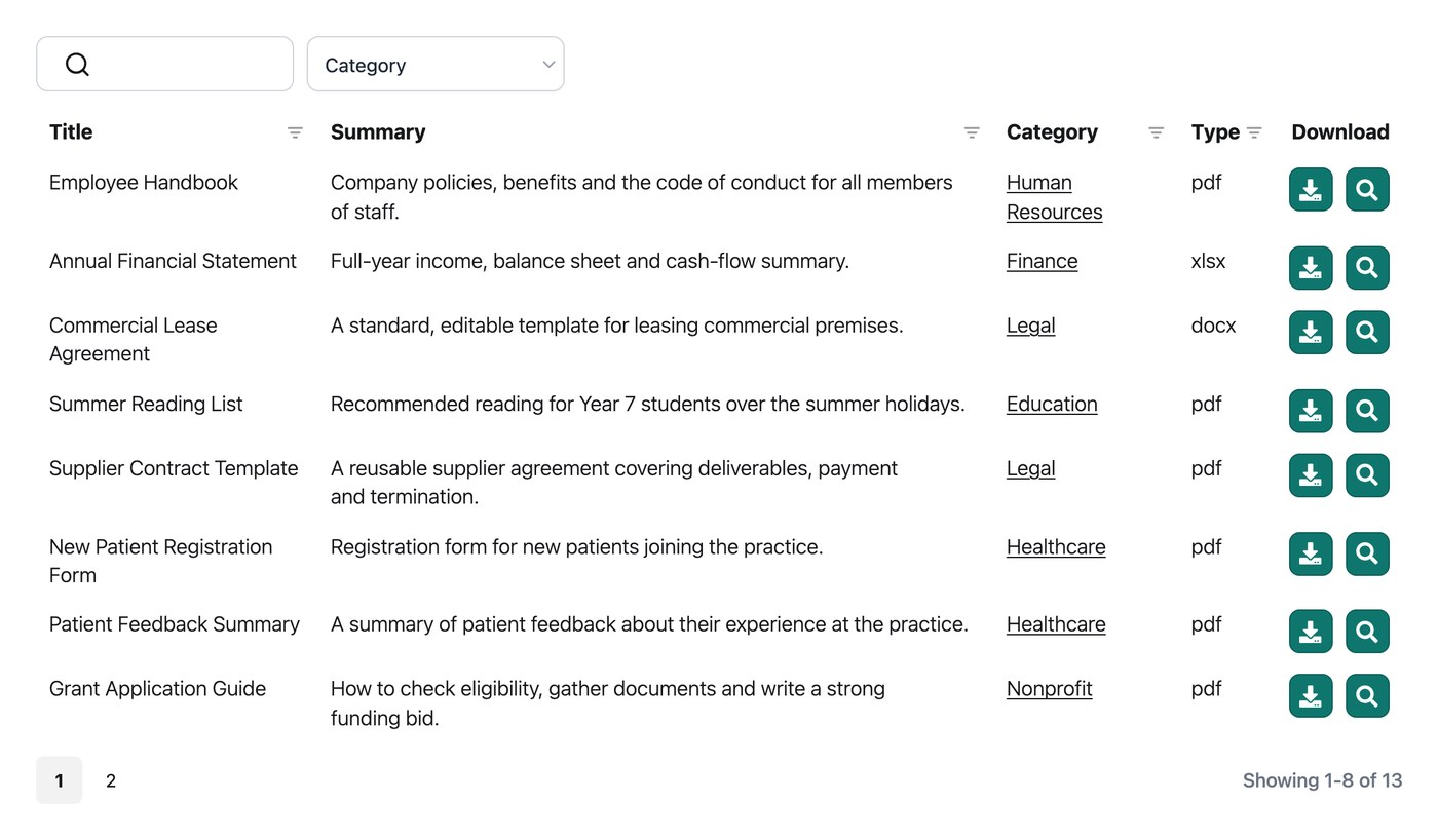
- Search box, the keyword search box at the top right of the table.
- Page length, the “Show x entries” select box.
- Totals, the count of documents in the library (such as “50 documents”).
- Pagination, the paging buttons that appear below a multi-page table.
- Infinite scroll, an alternative to pagination which loads more documents as visitors scroll.
- Reset button, the Reset link beside the search box that clears the current search and filters.
- Sticky header, which keeps the column headings visible while visitors scroll.
- Footer, an optional row at the bottom of the table that repeats the column headings.
Display search box
The search box lets visitors filter the table by keyword. It appears above the table, at the top right, and you can switch it on or off in the Library Builder. Read more about how the search works.
Display page length
The page length setting controls the “Show x entries” dropdown, which lets visitors choose how many documents to view at once. You can switch it on or off in the Library Builder, and choose where it appears on the settings and design page for your library:
- Above library. Above the table.
- Below library. Below the table (the default).
- Above and below library. In both positions.
- Hidden. Hide the dropdown.
Display totals
The totals setting controls the count of documents (such as “50 documents”) and where it appears. You can switch it on or off in the Library Builder, and choose its position on the settings and design page:
- Above library. Above the table.
- Below library. Below the table (the default).
- Above and below library. In both positions.
- Hidden. Hide the totals.
Display pagination
The pagination setting controls the paging buttons which visitors use to move between the pages of the library. You can choose where they appear on the settings and design page:
- Above library. Above the table.
- Below library. Below the table (the default).
- Above and below library. In both positions.
- Hidden. Hide the buttons.
Paging type
The pagination style setting controls the look of the paging buttons. Choose from five styles:
- Numbers only. Page numbers only (the default).
- Prev|Next. Previous and Next buttons only.
- Prev|Next + Numbers. Previous and Next buttons plus page numbers.
- Prev|Next|First|Last. First, Previous, Next and Last buttons.
- Prev|Next|First|Last + Numbers. First, Previous, Next and Last buttons plus page numbers.
Infinite scroll
Infinite scroll is an alternative to the standard pagination buttons. Instead of clicking through numbered pages, more documents load automatically as the visitor scrolls down the library. It works particularly well for browsing-style libraries where visitors are scanning rather than searching for something specific.
You can switch on infinite scroll on the settings and design page for your library. When it is enabled, the pagination options above no longer apply and are replaced by a Container height setting, which controls the fixed height of the scrolling area. The default is 70vh (70% of the height of the browser window), and you can enter any CSS length unit, such as 500px.
Reset button
The Reset button appears above the table and clears the current search and filters. You can switch it on or off in the Library Builder.
Sticky header
For the table layout, the sticky header setting keeps the column headings visible at the top of the screen while visitors scroll through a long library. You can switch it on in the Library Builder.
Show footer
For the table layout only, the footer setting repeats the column headings at the bottom of the table as well as the top. It is hidden by default, and you can switch it on in the Library Builder.